
Sustainable Identity for an Alaskan Seafood Venture
Seafood Branding: Alaska
Logo • Branding • Investor Deck • Presentation Design
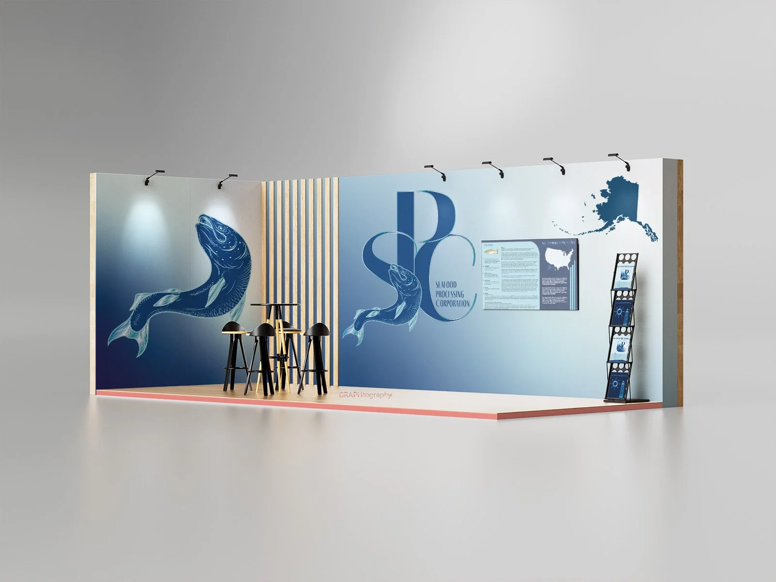
SPC (Seafood Processing Corporation) is a new Alaskan startup poised to redefine the salmon processing industry through sustainability and innovation. Partnering with Front Range Graphics, SPC’s brand identity was built to reflect quality, responsibility, and the freshness of Alaska’s waters - positioning them as a trusted name in premium seafood production.
Project Overview: Building a Sustainable Seafood Brand
SPC, a Delaware LLC based in Alaska, specializes in the processing and distribution of sustainably harvested salmon. The company’s mission is to bring high-quality, responsibly sourced seafood to market while championing environmentally conscious practices. Front Range Graphics was brought on board to create a strong corporate identity that would appeal to both investors and distributors, supporting SPC’s entry into the competitive seafood industry.
Challenges
Breaking into the global seafood market requires more than quality — it demands credibility and brand recognition.
SPC faced several challenges common to new entrants:
Establishing trust in an industry dominated by long-standing brands
Differentiating itself through sustainability and responsible practices
Creating a professional, investment-ready brand presentation
Developing a cohesive identity that communicates both freshness and reliability

Solutions: Designing for Credibility & Growth
Front Range Graphics developed a comprehensive brand strategy designed to position SPC as a premium, sustainable seafood processor.
Key solutions included:
1. Brand Identity Design: A clean, ocean-inspired logo design with modern typography that evokes freshness, professionalism, and environmental stewardship.
2. Messaging & Positioning: Crafted clear and compelling messaging around SPC’s commitment to sustainability, ethical sourcing, and Alaskan heritage.
3. Investor Deck Development: Designed and structured an investor presentation that communicates SPC’s market potential, operational plan, and long-term growth strategy.
4. Visual Cohesion: Created brand consistency across digital and print materials to reinforce credibility and attract investor confidence.

Results: A Brand Positioned for Growth
The branding and investor presentation established a strong foundation for SPC’s launch into the seafood market. The clear and consistent visuals have already gained attention from potential investors and distributors. SPC’s new identity communicates trust, innovation, and a deep respect for the environment — essential qualities in the sustainable seafood sector.
Key Takeaways: Designing Trust from the Start
SPC’s success demonstrates the importance of brand strategy in positioning new companies within competitive, sustainability-driven industries. By aligning visual design, messaging, and investor materials under one unified brand, SPC is prepared to enter the market with confidence and clarity.
For More Information about SPC’s Investment Opportunities, please contact
Maisie Navarro, Partner, COO - SPC - (720) 750-2691
Interested in learning more about branding for your business?
Contact Front Range Graphics today to discover how strategic design can transform your brand identity and attract the right audience.