
Logo Design & Corporate Identity
for a Construction Company
Construction Branding in Brookings, Oregon
Logo Design • Branding • Stationery • Employee Materials
Dave Hoover
Construction
Dave Hoover Construction partnered with Front Range Graphics to create a clean, professional brand identity built for everyday use across business materials and jobsite applications.
The goal was simple: develop a logo and visual system that is clear, recognizable, and easy to apply across print and internal use.

Project Overview:
A Clean, Practical Brand System
Dave Hoover Construction needed a straightforward brand identity that could be used consistently across business materials.
Front Range Graphics developed a logo and supporting assets focused on clarity, legibility, and professional presentation.

Challenges
Outdated logo that did not reflect the company’s professionalism
Inconsistent visuals across printed materials
Limited brand recognition in a competitive industry
No clear system for applying the brand across assets
Design Solutions
Discovery & Research
In-depth consultation with the DHC team to define brand goals, market positioning, and client perception.
Brand Identity & Visual System
Refined and rebuilt the existing logo into a clean, production-ready identity with improved typography and legibility across applications.
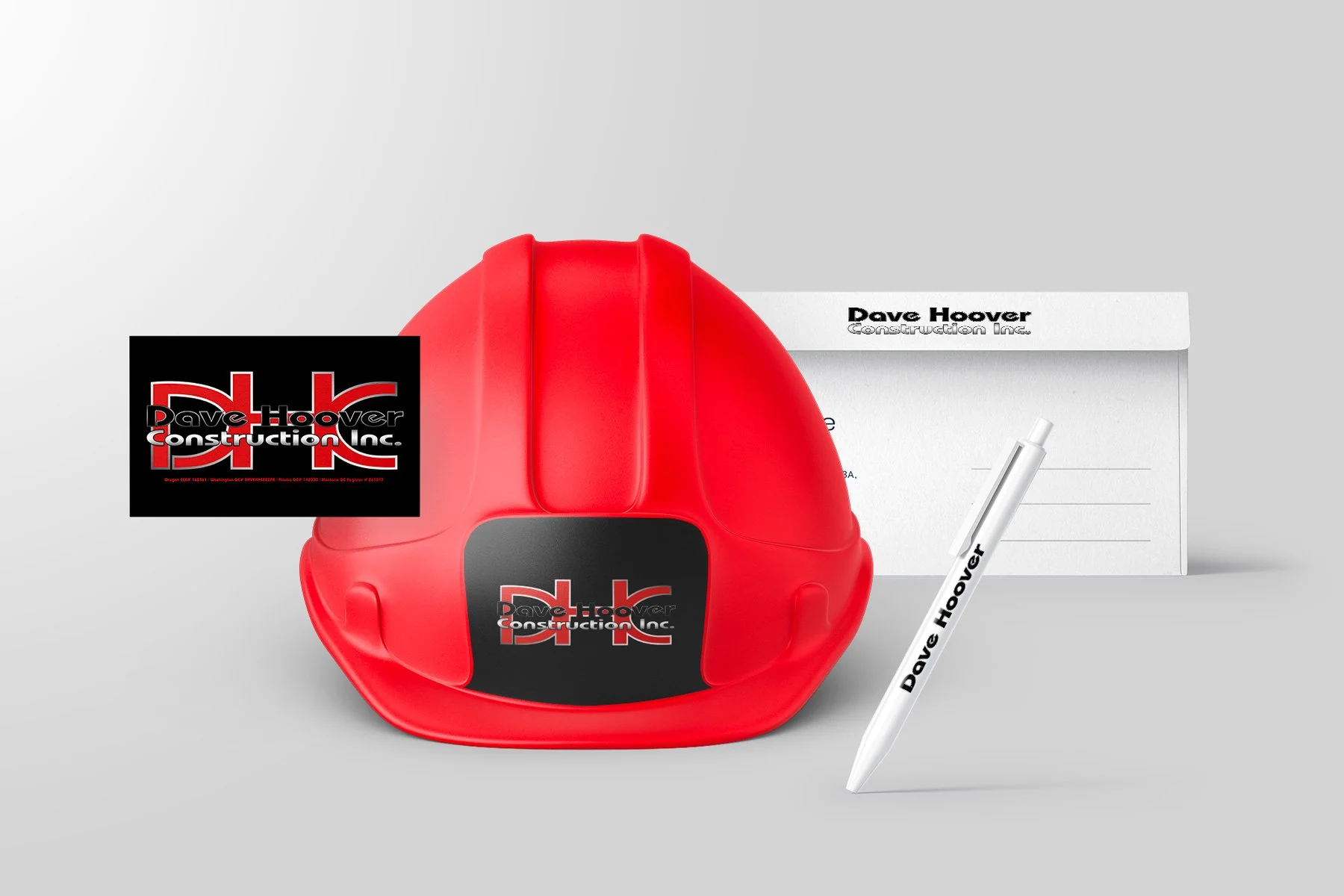
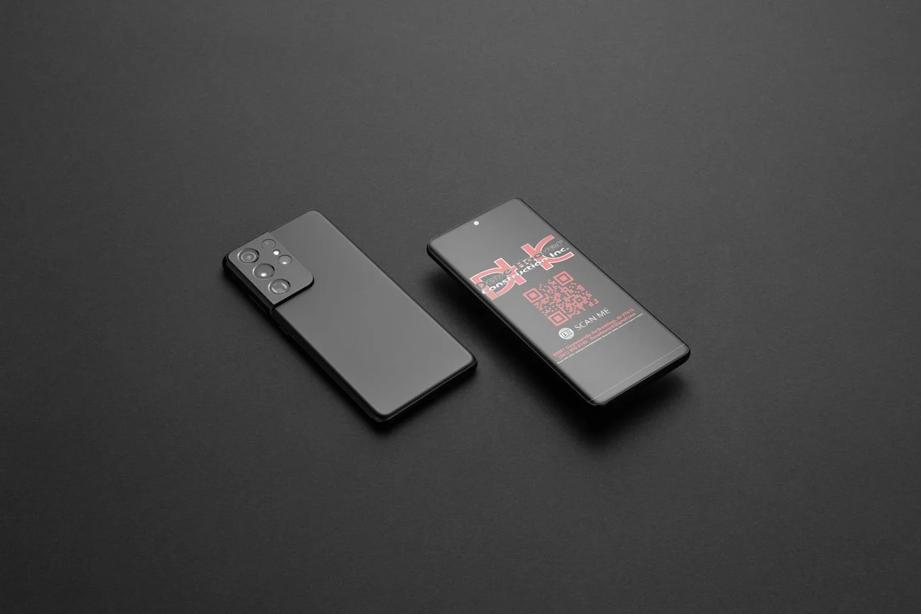
Print & Business Materials
Designed business cards, documents, and internal materials to ensure a consistent and professional presentation.
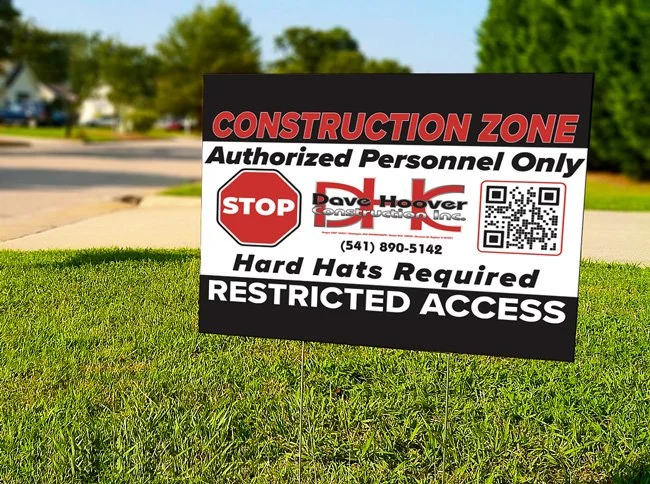
Employee & Jobsite Materials
Developed branded apparel and field materials built for visibility and everyday use.
Compliance & Information Integration
Incorporated contractor information and required details into branded materials for accurate representation.
Brand Application System
Created a flexible system that allows the brand to be applied consistently across future assets.
Results
The updated brand gives Dave Hoover Construction a clean, professional identity that is easy to apply across everyday materials and jobsite use.
Key Outcomes
Improved visibility and recognition with a consistent visual identity
Stronger trust through clear, professional presentation
Consistent branding across print, apparel, and internal materials
A scalable system that supports future growth

RELATED SERVICES
Interested in Services Like
Dave Hoover Construction?
From brand identity and print materials to apparel and field-ready graphics, we build complete branding systems that communicate professionalism, meet industry standards, and hold up in real-world job site environments.
___________
Strong, recognizable identities designed to reflect craftsmanship, reliability, and scale.
Business cards, documents, and internal materials designed for clarity, consistency, and daily use.
Branded Apparel & Uniform Systems
Hi-vis and branded apparel designed for safety, consistency, and a professional team presence.
Custom Signs & Job Site Graphics
Durable signage and graphics built for visibility, compliance, and on-site performance.